AP Central site
- Role: Senior UX Designer
- Company: The College Board
Challenge
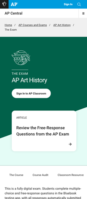
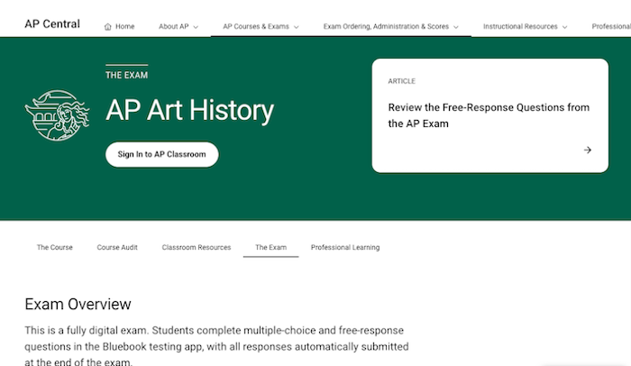
During my time on the AP project, this site was aimed at teachers and administrators (rather than students). This audience, along with the internal stakeholders for each course, voiced the concern that because all 39 AP course pages shared a design template, it was hard to differentiate them from each other. Users of the site were often confused or lost because the pages looked the same.
Solution
With the help of our Director of AP Online Platforms, I held conversations with our stakeholders about what kind of materials teachers and administrators got from AP for their courses. Those materials included large handbooks with brightly-colored covers and an illustration for each course. I proposed to design headers for each of the course sections that were based on those familiar visual cues.
I worked with visual designers to incorporate the color and the key illustration for each AP course into each course section. I also worked closely with the Director of AP Online Platforms to develop a content strategy for pages in each course section to have CTA cards based on the page purpose (for example, an exam date card on the exam information page header).
Result
After the launch of the updated pages, our users reported greater satisfaction and a sense of ownership that had not existed before the course-specific header content.
AP Central: https://apcentral.collegeboard.org/